Notes on Pink
By Thayer Bray, Exhibitions Coordinator
In walking through the galleries for the 30th Annual Undergraduate Juried Exhibition here at KCAC, the most notable, almost unifying element of the show reveals itself to be a single color: Pink. Of the 42 pieces in the show, 28 use pink in their compositions. In contemporary American culture pink is a gendered color. It denotes the feminine, the soft, but also the universal organic: ”We’re all pink on the inside.” Pink is the branded color of the most famous toy aimed at young girls. Pink is soft like bubble gum, like living tissue. Powder pink denotes quiet care and nurturing. Hot pink denotes excitement, high energy- flushed cheeks from excitement, pounding hearts full of joy, or fear, or desire. Pink is possibly the most human color, the most living color.

Angelica Drake, Pink Houses
In Angelica Drake’s multi-part composition Pink Houses, the idea of nurturing is brought into focus. This piece is comprised of a cluster of 7 platonic ”house” shaped canvases, with fine pale pink lace skirting sections or all of each form. In each house, there is a toddler, walking, napping, exploring, usually under trees, never looking directly at the viewer. What is most striking about these beautifully painted canvases is the use of intense, saturated, electric Hot Pink. Hot Pink frames and saturates each piece, creating an electric delineation between the times and spaces depicted in the canvas and the rest of the world. Pink seeps into the compositions themselves: bright pink playhouses, plush pink bubblegum interior fabrics. Pink turns into dry earth under a beloved tree, and becomes intense distant foliage. It is interesting to note the most naturalistically colored piece also features a secondary figure of an adult woman holding the child's hand while walking. They read as a type of doll house, playful, and memory filled. It makes me wonder if this intense, powerful color operates as a visual proxy for the intense love and emotion the Mother has for her Child. The intensity of emotion, intensity of love and of care the parent feels when looking at the child, mirroring the intensity of the color itself. This intensity of care is also alluded to in the support structures of the pieces themselves: the artist did not use the standard bars of wood, but welded steel rods. Protection and support, iron and lace.

Simon Angel, The Way Dogs Love Men
Love in pink is the subject of another work in the show, Simon Angel’s (I Will Love You) The Way Dogs Love Men (second-place winner of the The Leigh Rosenberg Earnest Memorial Fund award.) In this tall self-portrait in oil, we see the artist from the sternum up, his back arched and chest out, while his head emerges through glossy black glam rock curls, tilted up and to the side, wet eyes looking longingly upward and wide, as breath passing through luscious pink lips. A spiked bondage collar is around his neck, the chain taut, leading up off the image. His cheeks are flushed and glistening in humid passion and supplicant longing. In contrast to his vital and sanguine face, his body appears almost dead. The pale and sallow skin on his sternum fading to an almost corpse-like green abdomen and battered maroon flank. The prime signs of life neck-down seem to be his electric pink nipples and pale pink top-surgery scars. In this piece he seems to be playing with ideas of desire and mysticism, mending erotic devotion with divine passion, reminding me especially of Bernini’s Ecstasy of St Theresa. I wonder, however, if in this piece Angel is working toward a state of transcendental ecstasy through mortification of the flesh with this juxtaposition between the flushed and vital head and the pale and rigor-curved torso.
Verging toward an equally intense mystic sublime is Analiese Wheeler’s predominantly gouache and collage piece Bummer Summer. In this lush work, dominated by screaming, joyous greens, campfire orange-yellows, and creekwater-cool purples and blue-greys, a central figure rests on their haunches. Delineated in flashes of pink, pale purples and reflected foliage, it’s as though we have stumbled upon them by accident as they are kept rapt by the glowing forest floor before them. What is keeping this from being a simple contemplative scene of a figure in foliage, apart from the masterfully handled watercolor, is the almost hidden element: dozens of hand embroidered stars and spots, made of golden colored thread, travel across the scene. We are witnessing something special, a revelation, an epiphany. I wonder about the title, however, as there is nothing that I can see to be bummed about in this composition. Possibly it's the comedown of a psilocybin trip…

Analiese Wheeler, Bummer Summer
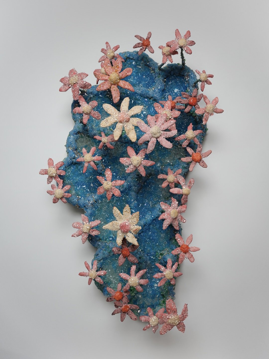
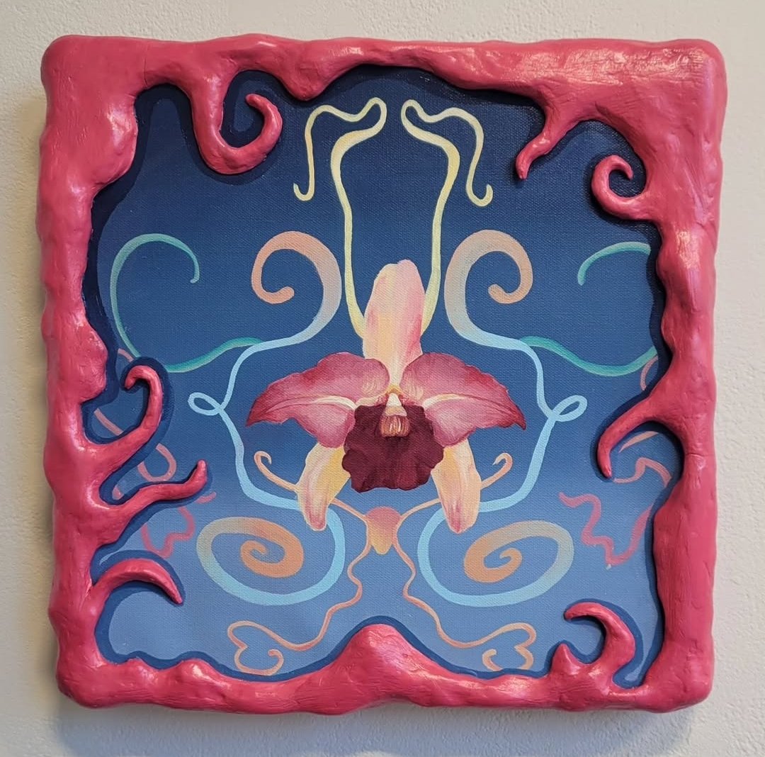
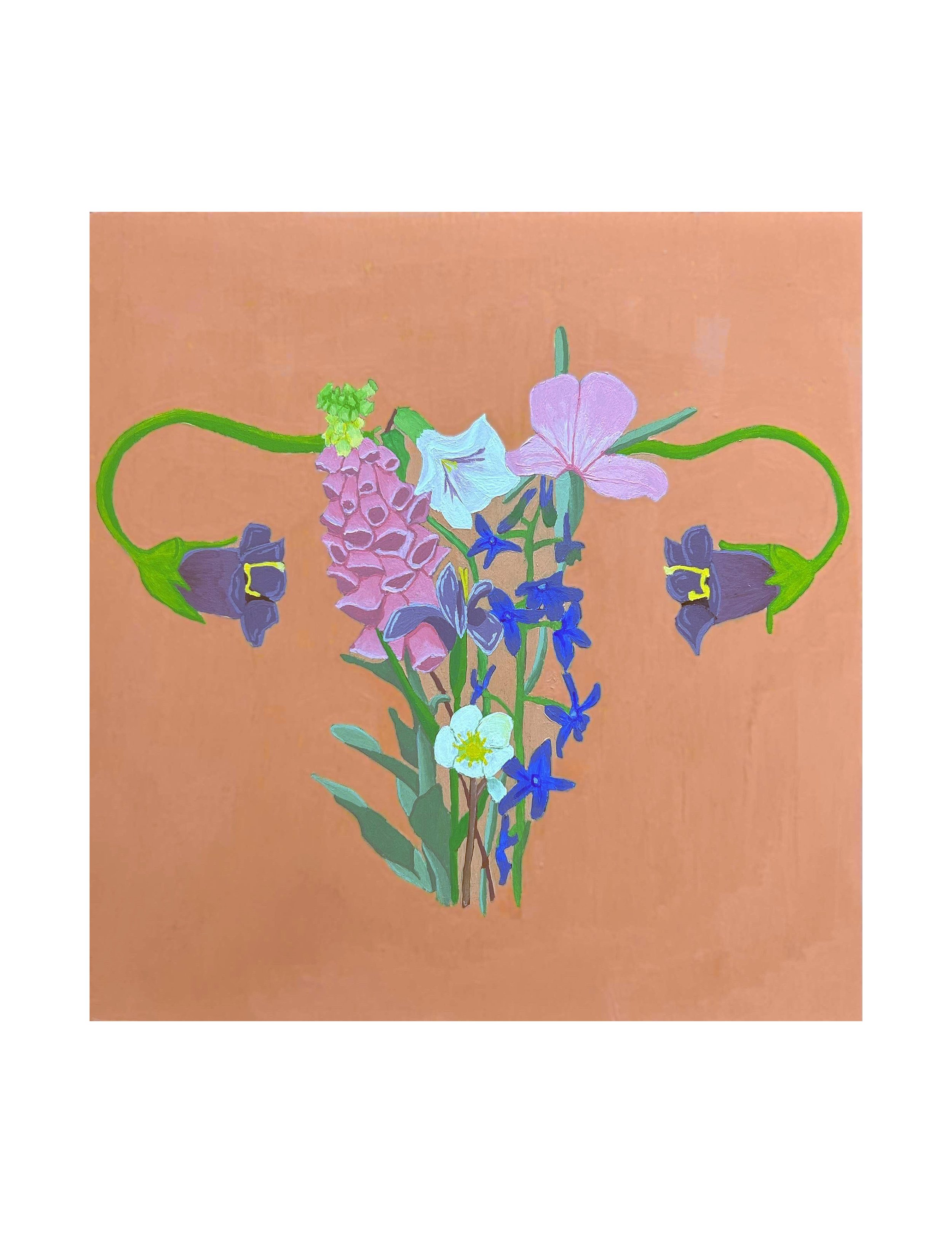
I couldn’t complete an essay on pink without acknowledging the profusion of floral imagery in the exhibition. In Caley Gabel’s wall sculpture The Snow is Falling, pink, cream and mauve daisies hover emanate from a ocean blue field of melted and fused glass, the flowers themselves frosted with clear beads like captured sleet. Alexa Burlison’s painting Guest Bedroom (Sandy) reminds me of my great aunt’s floral decor, unchanged for the past half century: Pink Flowers, pink frames; I can smell the decades of tobacco tar impregnated in doilies. In Kira Dimarco’s piece Metanoia, a lushly colored painting of a single orchid flower hovering in an ombre blue field surrounded by polychromatic arabesques reminiscent of various abdominal organs, and framed by a barbie-pink three dimensional foam form, its tentacles invading the picture plane. The word Metanoia means a change in one's way of life resulting from penitence or spiritual conversion; With this knowledge, I am spurred to return and reconsider the piece again and again. Ryland Brown’s Poison the Patriarchy is a seemingly pleasant painting of a flower arrangement in hysterform. Pleasant until you realize that each flower depicted is toxic to humans. Both these pieces with their reference to the human body underline the vitality of the color pink.
I wonder about the profusion of pink in this show. Is this a component of the zeitgeist? Is pink just the color of Gen Z? Is the use of pink a reclamation of the color, a refusal of the gendered symbolism imposed upon it in our culture, raising it to the level of a color that can evoke a panoply of responses in the viewer? Is the pink used in so many of these pieces just an artifact of the nascent artist exploring and playing with color? Whatever the reason, Pink, in its various permutations, is used to great effect by the artists in this show.